

100% Black and 4 Color Black Text: A Printer's Perspective
Posted Monday, May 13th • by CK • Print Specialist

This is a great topic that has come up numerous times in discussion with customers and designers we work with. The following article will help explain what 100% black text is, how it differs from "rich" 4 color black text and when it should be used while preparing your artwork for commercial offset printing. The benefits of using 100% black text are more apparent when printing a high volume job on an offset press, more on that below.
CMYK Color, Printing Registration & How It Affects The Finished Print
Offset and Digital presses print using a mixture of 4 colors called "CMYK" colors which stand for Cyan, Yellow, Magenta and BlacK. These four CMYK colors are used to reproduce the full color spectrum in printing that we see in posters, brochures, calendars, etc. Depending on the design, there are circumstances where you would want to use pure black text which is printed using only black ink instead of a mixture of 4 colors.
When printing high volume jobs on a traditional offset press; 4 separate color plates of your artwork are attached to rollers which collect and print ink on paper. Each plate prints one of the four process colors I mentioned above; Cyan, Yellow, Magenta and BlacK. As the sheet fed paper runs through the printing press, it moves quickly across each of the 4 rollers/plates and the ink is then imprinted onto the paper. If the text in your artwork only contains 1 color / 100% black ink, then 3 other plates are not used, need to be aligned or printed on paper to reproduce your artwork. If the black text in your artwork contains a mixture of 4 process colors instead of just one, then all 4 color plates would need to stay in perfect registration to print clearly which can be difficult for many printing companies.
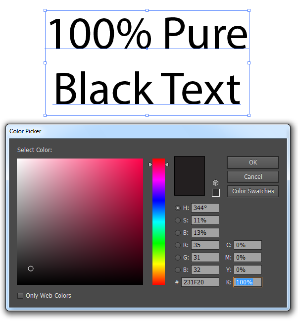
Above is an example of the color picker tool in illustrator highlighting a selection of 1 color black text. Note how "K" or black, is 100% and the other 3 process colors are all 0% percent. Using illustrator, indesign, or photoshop you will be able select your text and specify the percentage of black ink using.
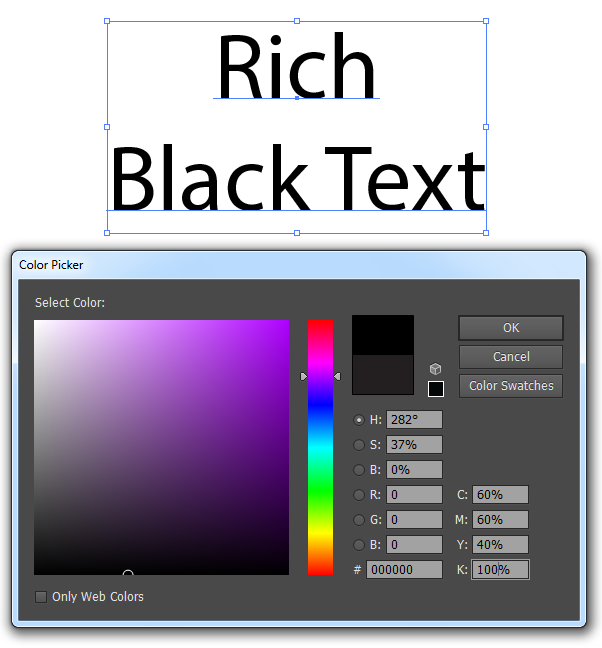
4 Color Rich black text as illustrated above has a richer appearance of black and is often use for very large text in posters that accompany and match darker graphics and photos. Note that rich black ink is created using percentages of all 4 colors within the CMYK color palette.
100% Black Text Will Print Sharper and Leaves Less Room For Error
Think about this. To print your job, paper needs to move through a printing press at very high speed and line up with each plate perfectly to reproduce your artwork. The press operator can control the alignment of the plates while the press is running and make fine adjustments to affect the "printing registration" which is a technical term that simply means how well the 4 color plates are aligned.
Here's the thing. As a matter of quality control, all printing companies are supposed to maintain their printing presses, employ experienced staff and make sure printing that comes off their offset press stays in register. The reality as many have experienced is that some printers are better at it than others and when it comes to holding registration, results vary from company to company. To those unfamiliar with design and commercial printing methods, they might receive a job and notice that some of the text appears blurry. Yet if you magnify the text, you can see the all to common problem I just described. One major cause of the blurry text in print is because 4 color text is being printed and the press did not hold registration as illustrated below.
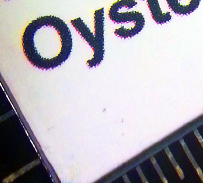
As you can see in the 4 color black type example above; not all of the 4 color plates printed in perfect register and are not lining up. This example isn't even that bad by printing standards.
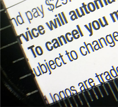
The text in the image above is printed using 1 color 100% black text and as you can see, it prints clearer, without the possibility of other colors plates printing out of register.
Sure, it is absolutely the printing company's responsibility to make sure their presses stay within register when printing your job. Also, keep in mind that 4 color type printed out of register is most noticeable with small text being focused on and read. In fact, if you have a registration issue with your printed job the entire page generally has a problem, it's just most visible with small type.
There are simply too many variables to think about, like whether or not your printers equipment has been serviced, if their press operator is on the ball instead of on their phone, etc. etc. This is an extremely common problem that many designers are unware of and can easily avoided by selecting 100% black for all small text during the design phase.
All you need to do is eliminate any chance of a problem by creating your text using 1 color 100% black ink. Doing so will save valuable time being productive instead of dealing with reprints, determining fault, negotiating discounts and all the other situations that go along with a botched print job by thinking ahead and adjusting your design.
|
Stay Informed & Save On Printing @ImageKrafters
Joining our mailing also makes you eligible to receive online printing promo codes and specials we occasionally offer to our customers and followers. It is our promise never to sell or misuse your info. We despise spam like everyone else! |

